Time Series Modeling
Code status: The code on this page was corrected on 17 September 2026 against the current Earth Engine Data Catalog and API documentation. It has not been executed against Earth Engine. Screenshots, printed values and described outputs come from earlier versions of this lesson and may differ from what the corrected code produces.
Overview
The purpose of this tutorial is to establish a foundation for time series analysis on remotely sensed data. You will be introduced to the fundamentals of time series modeling, including decomposition, autocorrelation, and modeling historical changes. At the completion of this tutorial, you will be able to build an explanatory model for temporal data which can be used in many different avenues of research.
Background
One of the paradigm-changing features of Earth Engine is the ability to access decades of imagery without the previous limitation of needing to download, organize, store, and process this information. For instance, within the Landsat image collection we can access imagery back to 1972, allowing us to look at an area to visualize and quantify how much it’s changed over time. With Earth Engine, Google maintains the data and offers its computing power for processing - users can access tens or hundreds of time-sequenced images and quantify change across decades.
To explain the concepts of time series modeling, let’s begin with a dataset that illustrates what we are trying to do. The line chart below references electricity production over thirty years, with one distinct data point per month. What can we observe?
- Production tends to increase each year - In this case, it appears to level out after 2010, but there is a general trend upwards.
- Within each yearly cycle, we see that there is a sharp peak in June and July, and a trough in October and December. An annual, 12-month cycle is specifically referred to as ‘seasonality’, although there can be other cyclical time periods (e.g., a housing market in a specific area may see a recurring pattern in house prices that occurs roughly every 7 years).
- Finally, the magnitude of the difference between each yearly peak and trough increases over time as well.
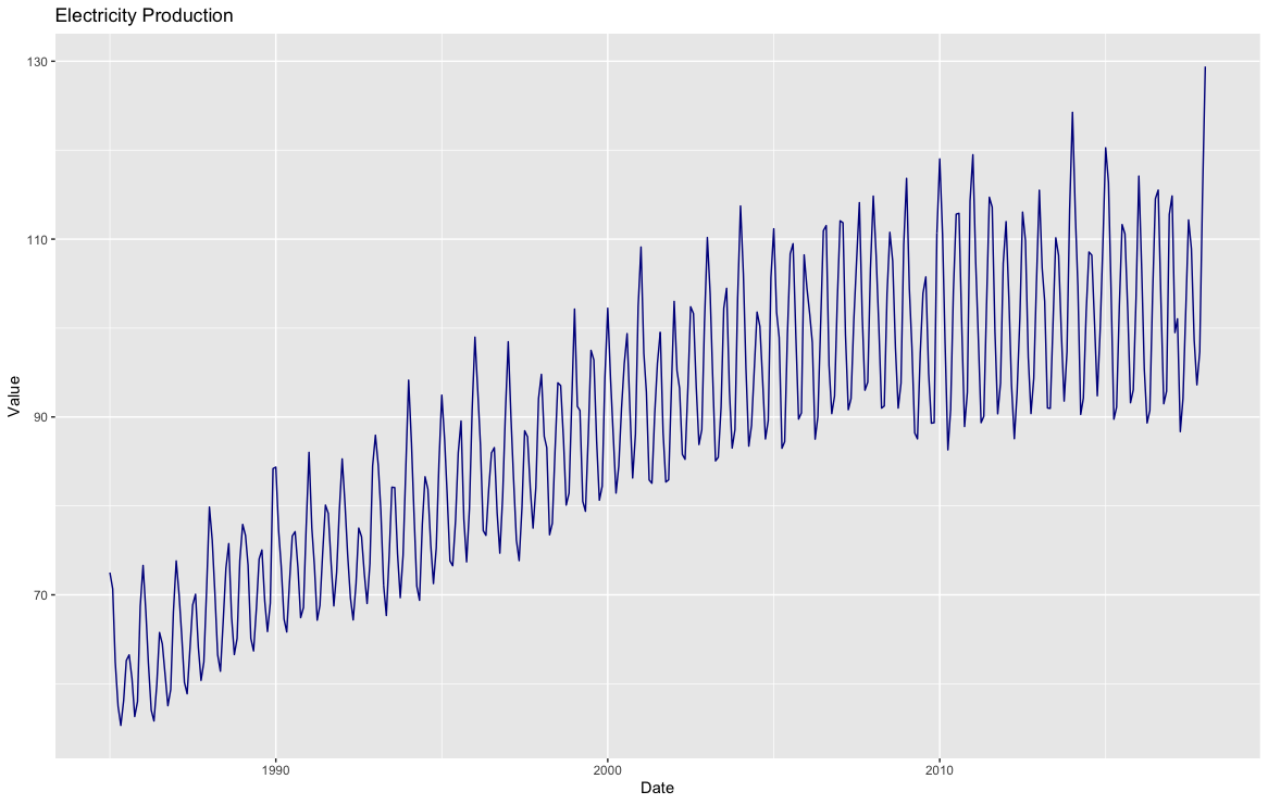
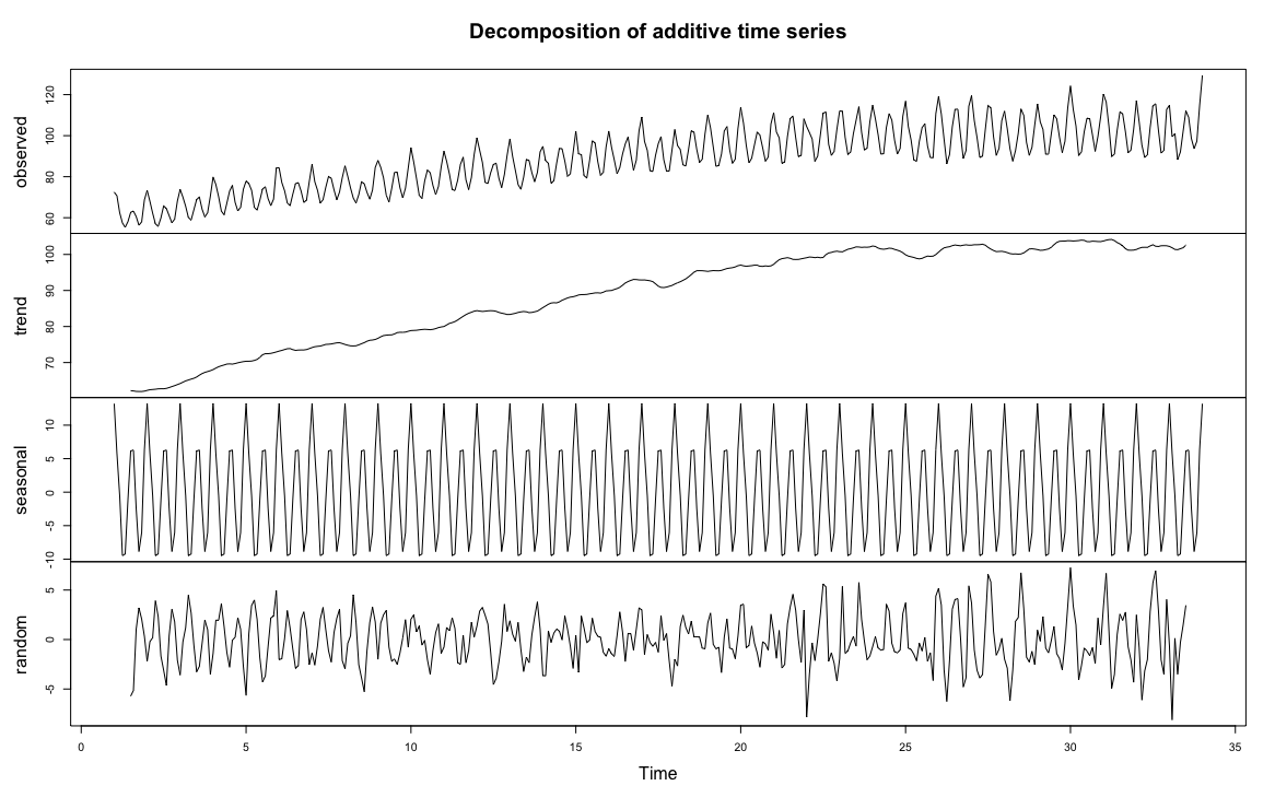
With these observations, we can address each of the components individually and perhaps build an explanatory model. The time series decomposition below (generated in R) breaks up the data into separate components:
- The ‘observed’ line chart is the data in its original form.
- The next chart is a trendline built using a window function (each data point is plotted as a centred moving average over a 12-month window). You can see the general trend of the data and determine whether a linear fit is appropriate.
- The seasonal chart seeks to identify cyclical patterns in the data (in this case, patterns that repeat every 12 months). It subtracts the trend from the observed points and averages the data for each time period (month).
- Finally, the ‘random’ line chart is the residual amount remaining when you remove the trend and seasonality from the data.
Limitations in Remote Sensing Time Series
Time series modeling aims to build an explanatory model of the data without overfitting the problem set—to use as simple a model as possible while accounting for as much of the data as possible. The previous example was used to illustrate the concepts of breaking down time series data into component parts, but remote sensing data has additional limitations that make this more challenging. Note that in the previous example there was a well-formed data point for every single month—nothing was missing or obviously erroneous. It is almost inevitable that you will not get this same level of precision from remote sensing data. Landsat-8 has 16-day temporal resolution, but depending on the area, removing cloudy pixels will remove a significant portion. In a test area in the Galapagos Islands, over 85% of the data was removed due to cloud masking or atmospheric conditions. Issues such as the Landsat 7 Scan Line Corrector malfunction might prevent a cohesive time series dataset depending on your time period of research. Also, while the time series example we used involved measured values on the same scale throughout the time series (e.g., a gigawatt is the same unit of measurement throughout the entire time series), with remote sensing we often run into situations where the magnitude of measurement changes. If we are researching winter crop yield and an image is collected right after a heavy snowfall, how do we compare this value? Do we keep this data or remove it? Additionally, atmospheric conditions can skew the visual results, where the hue of the vegetation changes drastically from image to image due to atmospheric conditions (fog, ground moisture, cloud cover).
It is important to understand the characteristics of both your data and what you are trying to measure. Building a time series model to understand cyclical changes in vegetation can provide useful information in understanding crop yield, but if you do not account for issues in the data, you can end up building a time series model with erroneous results. Many time series modeling tools, such as ARIMA modeling, are not directly applicable in certain settings due to missing data, non-standard collection periods and varying intensity due to atmospheric conditions. In this tutorial, we will focus on understanding linear trends and harmonic modeling.
Multi-Temporal Data in Earth Engine
Time series data in Earth Engine are represented as a series of images called ‘Image Collections’. As a result of the complicating factors in remote sensing discussed earlier, analyzing time series in Earth Engine is unlike time series modeling in traditional methods. From a programming sense, we will join data together to define temporal relationships between collection items and build functions to reduce this time.
First, some very basic mathematical notation for time series. A time series is an array of the value being measured, sorted chronologically:
$$\mathbf{p} = (p_{t_0}, p_{t_1}, \ldots, p_{t_N})$$
where each $p_{t_i}$ is the value measured at time $t_i$.
Data Preparation and Preprocessing
The first step in analysis of time series data is to import data of interest and plot the data around our region of interest, a deciduous forest near Blacksburg, VA, USA.
We begin by loading in the Landsat 8 collection and provide a point at the region of interest. Additionally, we will create a time field.
;
// This field contains UNIX time in milliseconds.
;
The function maskL8sr is a cloud masking function that uses the QA_PIXEL quality band of Landsat 8 Collection 2 to mask out any pixels flagged as cloud, dilated cloud or cloud shadow, and applies the Collection 2 scale factors to the surface reflectance bands. Note that this function is Landsat 8 specific, using other platforms will require a different setup.
// Function to cloud mask and scale Landsat 8 Collection 2 Level 2 data
// using the QA_PIXEL band.
We’ll use the Normalized Difference Vegetation Index (NDVI) as our time series signal. It is a well-known metric for measuring vegetation productivity—for this region of interest, we expect there to be strong seasonality, and perhaps a gradual linear trend over time. In the code block below, we create a function called addVariables that extracts the date of each image, calculates NDVI, and adds it as a band. We can then use .map() to apply the two functions we defined to build a time series model of our data.
// Use this function to add variables for NDVI, time and a constant
// to Landsat 8 imagery.
;
// Remove clouds, add variables and filter to the area of interest.
roi
maskL8sr
addVariables;
To visualize the data, we will export a chart at the location of interest. We will add a linear trend line for reference.
// Plot a time series of NDVI at a single location.
'ScatterChart'
;
l8Chart;
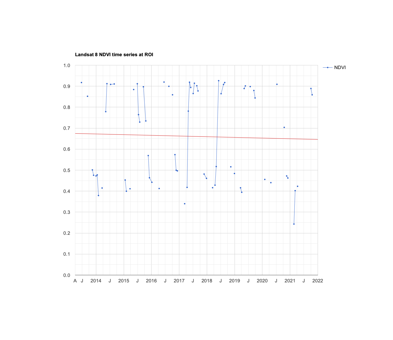
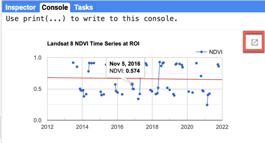
You can click on the ‘export’ button next to the chart to view an interactive chart. Scroll over some of the data points and look at the relationships between the data. A line connecting two dots means that they are sequential data points (notice that there are relatively few sequential points). We can also see that there are relatively large jumps in the data, with an upward climb somewhere between March and late April, and a descent in late August. Each year is slightly different, but we can surmise that this is due to leaf-out in the spring, driven by temperature and day length, and leaves dying off in the fall. Finally, the general trend is downward, although the February 2021 datapoint might have significant leverage on the trend.
Linear Modeling of Time
Lots of interesting analyses can be done to time series by harnessing the linearRegression() reducer. To estimate linear trends over time, consider the following linear model, where $\epsilon_t$ is a random error:
$$ y = \beta_0 + \beta_1X_1 + \ldots + \beta_nX_n + \epsilon_t \tag{1} $$
This is the model behind the trendline added to the chart you just created. We can use this model to detrend our data (explain the upward or downward movement of the data by subtracting the fitted model values from the observed values). For now, the goal is to discover the values of the beta coefficients.
To fit this trend model to the Landsat-based NDVI series using Ordinary Least Squares (OLS), use the linearRegression() reducer:
// List of the independent variable names
;
// Name of the dependent variable.
;
// Compute a linear trend. This will have two bands: 'residuals' and
// a 2x1 band called coefficients (columns are for dependent variables).
, 1;
// Flatten the coefficients into a 2-band image
;
// Display the coefficients image (bands 'constant' and 't').
coefficients, , 'Trend coefficients';
The image added to the map is a two-band image in which each pixel contains values for $\beta_0$ (band constant) and $\beta_1$ (band t). Click around the map with the inspector, and look at some of the t values: a negative value indicates a downward NDVI trend at that pixel, and a larger magnitude indicates a steeper change.
Use the model to “detrend” the original NDVI time series. By detrend, we mean account for the slope of the chart and remove it from the original data.
// Compute a detrended series.
;
Plot the detrended results
;
detrendedChart;
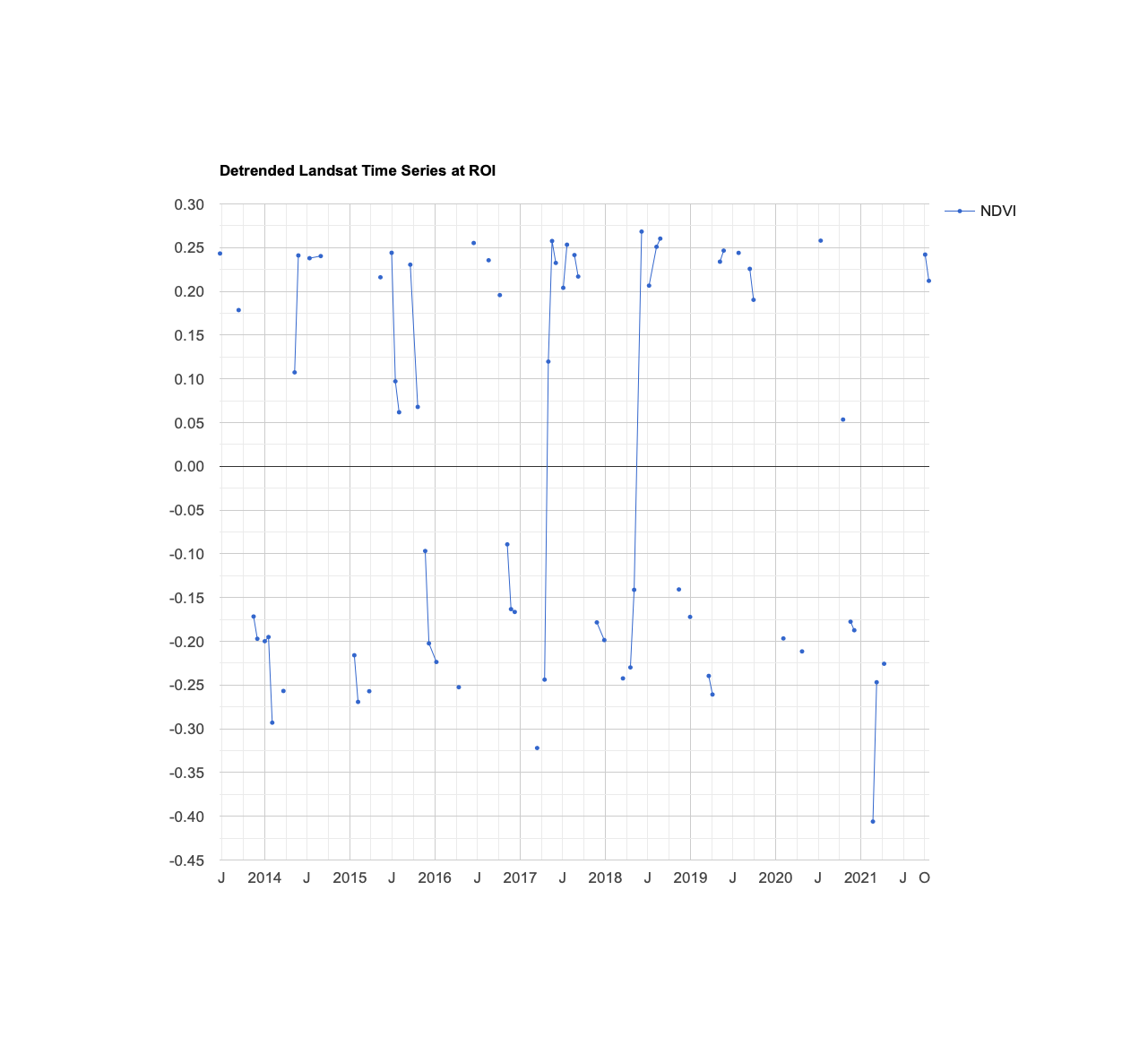
Compared to our earlier graph, the data looks similar—but now, the slight downward slope is accounted for with our linear model. Each fitted data point (data point on the linear model) is subtracted from each of the observed data points. Additionally, the Y-axis is now centered at 0, and the scale ranges from 0 to +/- 0.45 This allows us to focus on cyclical patterns in the data with long-term trends in the data removed.
5.2 - Estimate Seasonality with a Harmonic Model
Consider the following linear model, where $e_t$ is random error, $A$ is amplitude, $\omega$ is frequency, and $\phi$ is phase:
$$ p_t = \beta_0 + \beta_1t + A\cos(2\pi\omega t - \phi) + e_t $$
We can decompose our function into separate cosine and sine elements.
$$ p_t = \beta_0 + \beta_1t + \beta_2\cos(2\pi\omega t) + \beta_3\sin(2\pi\omega t) + e_t \tag{2} $$
Note that $\beta_2 = A\cos(\phi)$ and $\beta_3 = A\sin(\phi)$, implying $A = \sqrt{\beta_2^2 + \beta_3^2}$ and $\phi = \operatorname{atan2}(\beta_3, \beta_2)$ (the two-argument arctangent, which the code below uses).
In simpler terms, we are breaking up more complex curves into a set of simplified cosine waves with an additive term. Mark Jakubauskas has an informative paper that breaks down the process, and there are many resources that elaborate more on the math behind harmonic models. Building a harmonic model is used in remote sensing applications because of its flexibility in accounting for cyclicality with simple, reproducible shapes. If there is a seasonal trend in the data, the ordered nature of a cosine curve can likely approximate it.
To fit this model to the time series, set $\omega$=1 (one cycle per unit time) and use ordinary least squares regression as the metric of error reduction.
First, add the harmonic variables (the third and fourth terms of equation 2) to the image collection.
// Use these independent variables in the harmonic regression.
;
// Add harmonic terms as new image bands.
;
Fit the model with a linear trend, using the linearRegression() reducer:
dependent
// The output of this reducer is a 4x1 array image.
;
Plug the coefficients into equation 2 in order to get a time series of fitted values:
// Turn the array image into a multi-band image of coefficients.
;
// Compute fitted values.
;
// Plot the fitted model and the original data at the ROI.
, roi,
, 30
;
The harmonic model (the fitted series) does an adequate job of predicting the data. There is a datapoint in Feb 2021 that is significantly lower, but this appears to be an outlier. Additionally, the model misses a significant dip in July 2015, although this might be due to irregular climate conditions—other years did not have the same dip.
Question 1: Produce the resulting chart and interpret it.
Although any coefficients can be mapped directly, it is often useful and interesting to map the phase and amplitude of the estimated harmonic model. First, compute phase and amplitude from the coefficients, then incorporate this information into each pixel. Use the inspector to look at the pixels and note their phase and amplitude.
// Compute phase and amplitude.
'cos'
// Scale to [0, 1] from radians.
-Math.PI, Math.PI;
'cos'
// Add a scale factor for visualization.
5;
// Compute the mean NDVI.
;
// Use the HSV to RGB transformation to display phase and amplitude.
rgb, , 'phase (hue), amplitude (sat), ndvi (val)';
Question 2: Produce the resulting map layer and describe its salient features.
Complex Time Series Modeling
A time series can be decomposed as the sum of sinusoids at different frequencies. The harmonic model presented here can be extended by adding a cos() band and a sin() band for each higher frequency, for example a second pair at two cycles per year.
You can look at this GEE example of using multiple sinusoids to build a more complex harmonic model. Note that each year there is a high peak in June and a secondary peak in January—this harmonic model consisting of two sinusoids with separate frequencies and amplitudes is able to account for that. However, the error values in this model are high and the fit is quite inexact. We can see extreme drops in the NDVI value that the model misses, and several peaks each year that do not fit.
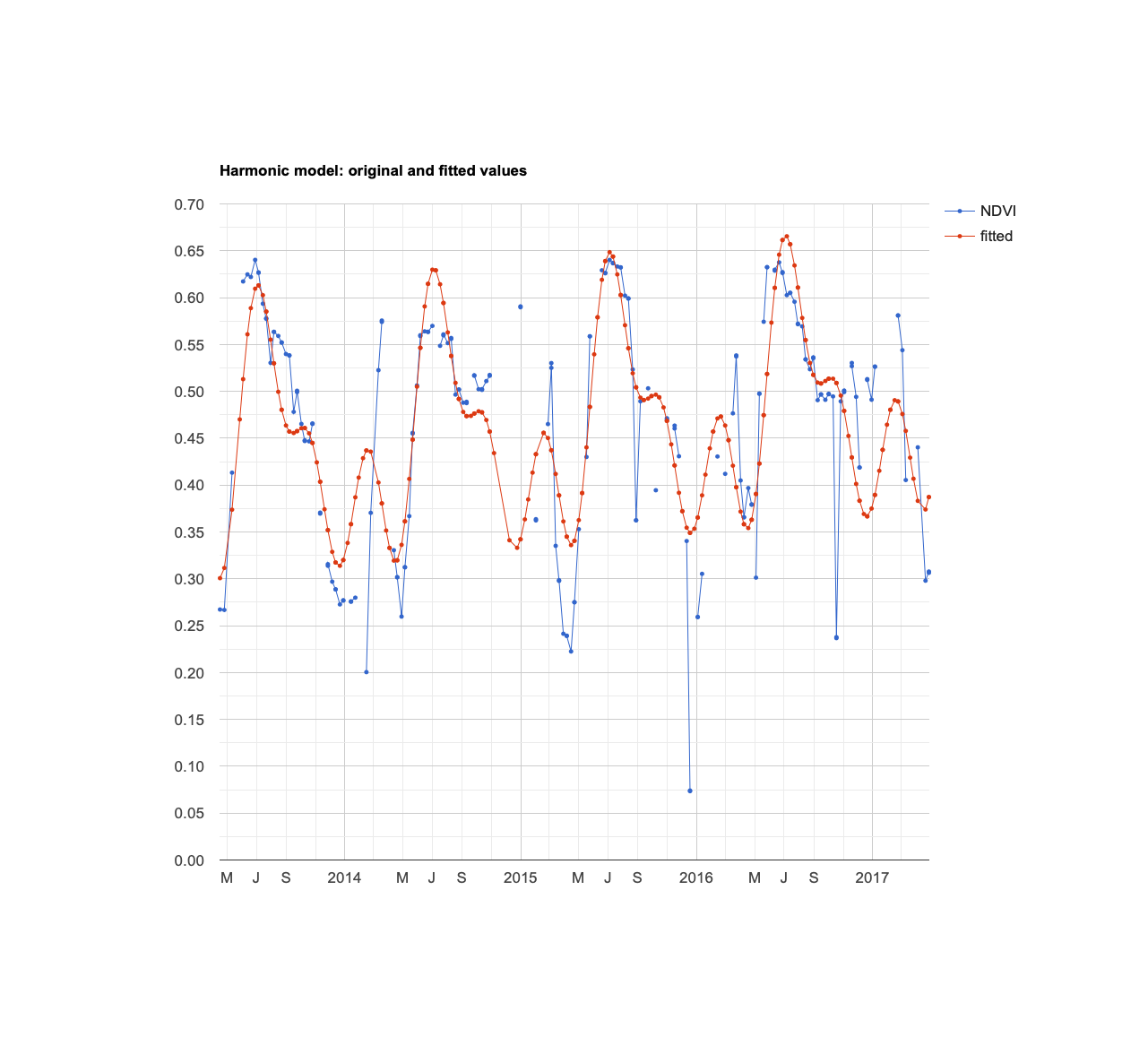
More complex harmonic models might not be appropriate due to overfitting—in other words, this model might provide a false sense of comfort in its explanatory ability. Time series modeling of remote sensing data is more difficult than many business or scientific contexts due to masked data, missing data, irregular atmospheric conditions, and natural variability.
Exporting Data
Many of you might be more familiar with building statistical models in other languages or tools, such as Python, R or JMP. In that case, you might want to export the data for your own analysis. There are several ways to do it, but the simplest method is to click the ‘expand into new tab’ button next to the chart that contains the data you want to work with (likely the raw NDVI data). In the new tab, you can click ‘Download .csv’, which is a data table that you can use with whichever software you prefer.
5.3 - Time Series Thresholding
Urban change detection is a burgeoning field in remote sensing that identifies historical urban development and works to predict where future urban development will occur. Remote sensing is a vital partner in this field, as it can provide an unbiased, quantitative assessment of change over time. For instance, Greece is using Google Earth Pro to scour the countryside for signs of tax evaders (ex., a luxury pool built without a permit may indicate sheltered money). Other countries are using classification models in Google Earth Engine to characterize urban development.
In this example, we will go over a simple, but very effective method of identifying urban development, based on real-world experience. In nearby Roanoke (located about 45 minutes east of Virginia Tech), like any other city, there has been significant construction in the past few years. Around 2018, construction of an assisted living facility began on a patch of trees and pasture. Let’s test to see if we can identify this construction. We will use the Landsat 8 image collection, and import our test point as var roi. The process of building the chart is the same as earlier, and we will use NDVI as our change metric, as we can hypothesize that new construction will greatly reduce NDVI.
// Test area - lat/long acquired from Google Maps
;
// This field contains UNIX time in milliseconds.
;
// Function to cloud mask and scale Landsat 8 Collection 2 Level 2 data
// using the QA_PIXEL band.
// Use this function to add variables for NDVI, time and a constant
// to Landsat 8 imagery.
;
// Remove clouds, add variables and filter to the area of interest.
roi
maskL8sr
addVariables;
// Plot a time series of NDVI at a single location.
'ScatterChart'
;
l8Chart;
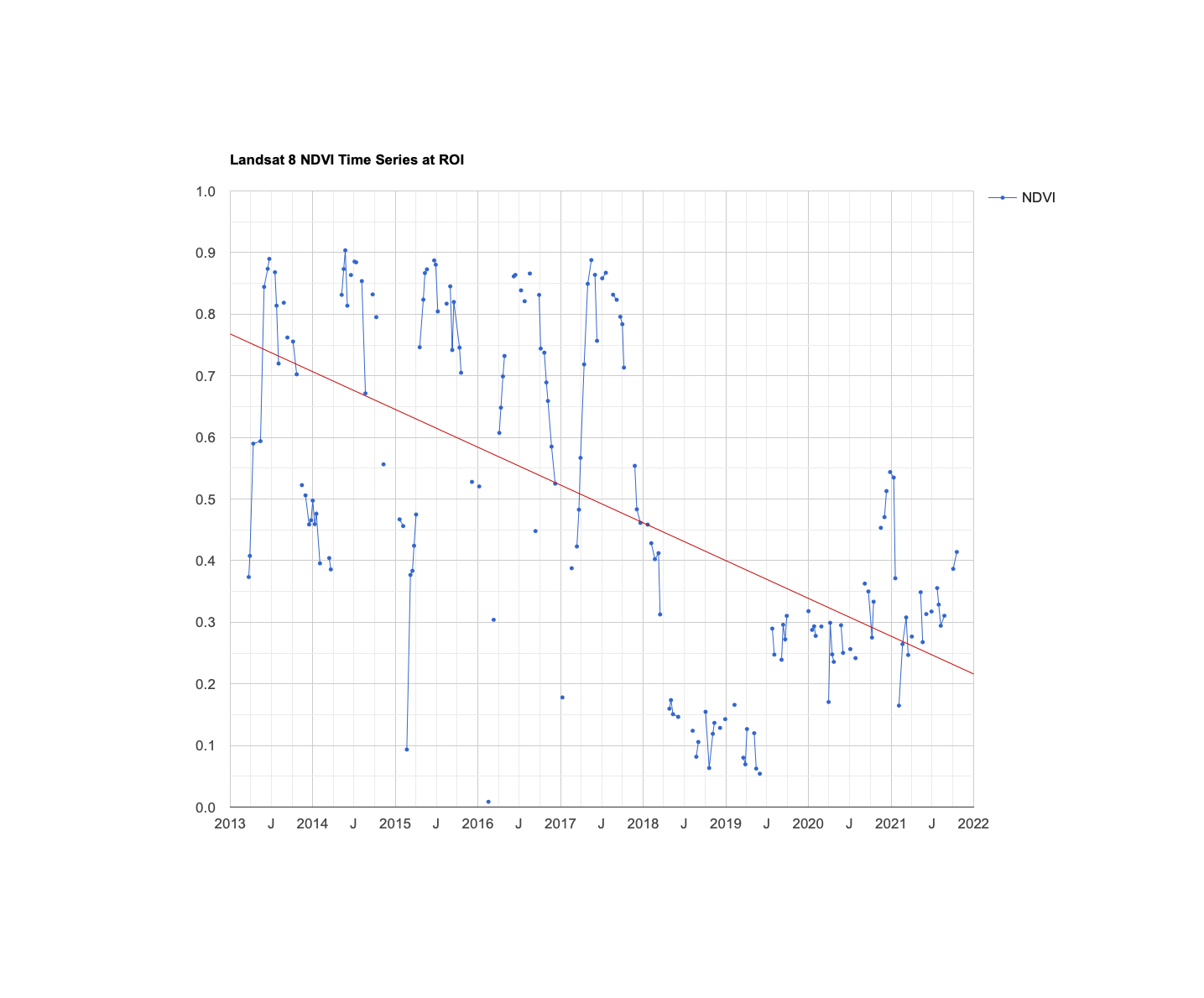
Below is the chart from an earlier version of this lesson. NDVI rises and falls with the seasons until early 2018, then drops sharply between March and April 2018 and largely stays low afterwards. In addition, the cyclicality is gone after 2018, and while there are some elevated values in late 2020, that is likely due to atmospheric conditions or sensor calibration. The linear trend is an indication of construction, and perhaps a window function to average out the variability can help identify large drops in the overall average NDVI for this test point.
There are some interesting ways you can expand this general idea - for instance, you might be able to build a system that automatically identifies urban development that occurs when it occurs in your test zone. Global Forest Watch applies a related idea at scale: its near-real-time deforestation alerts (such as GLAD-L, GLAD-S2 and RADD) are derived from Landsat and Sentinel imagery and flag likely forest disturbance soon after new images arrive. Note that different image collections have different timelines (for instance, Landsat 8 would not be able to detect urban change before 2013), and you may have to set up this system differently for different satellite platforms.